A Bold Neubrutalist Redesign for Seamless Listening
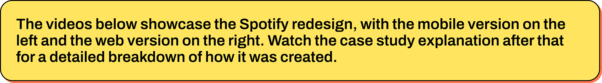
The Overview
A dual-mode neubrutalist redesign of Spotify’s mobile and web experiences improves discovery, cross-device continuity, and social connection while unifying light and dark visual systems. The design re-centers listening, discovery, and creator-listener feedback with bold hierarchy, clear actions, and accessible contrast balancing style with measurable task efficiency.
The Problem
Music platforms face visual sameness and clutter, with dense menus, unclear affordances, and hidden social cues that weaken discovery, playlisting, and multi-device flow. Many redesigns prioritize aesthetics over clarity, ultimately compromising long-term usability.
The Goals
Boost discovery and playlist creation by making core actions visually dominant, consistent, and accessible with a single gesture.
Use neubrutalism’s bold hierarchy to cut through choice paralysis while maintaining contrast and restrained motion in light and dark modes.
Improve cross-device continuity through aligned navigation, consistent player affordances, and visible saved states across web and app.
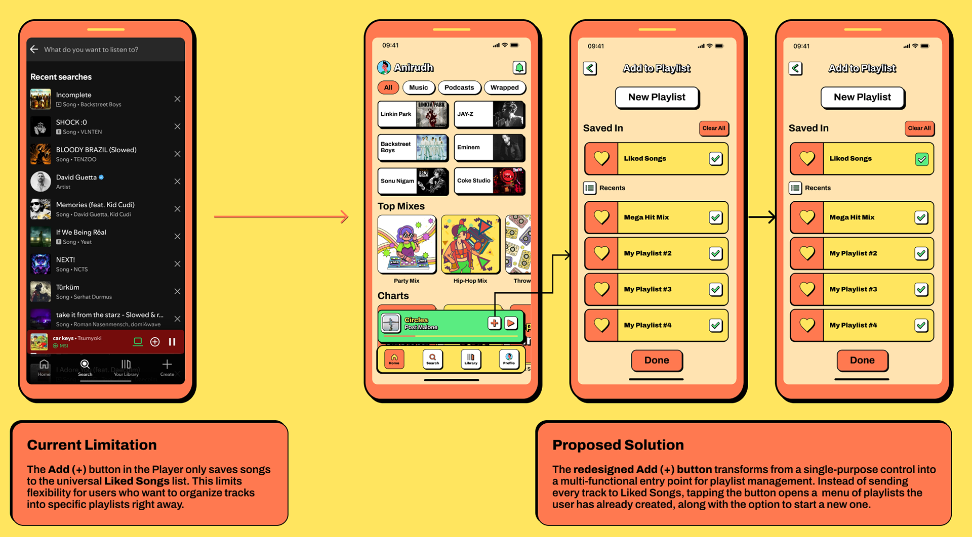
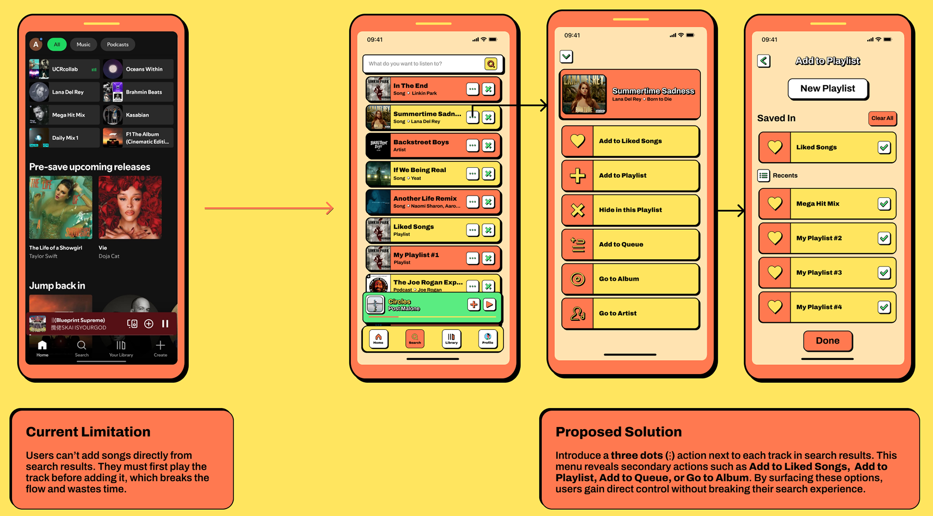
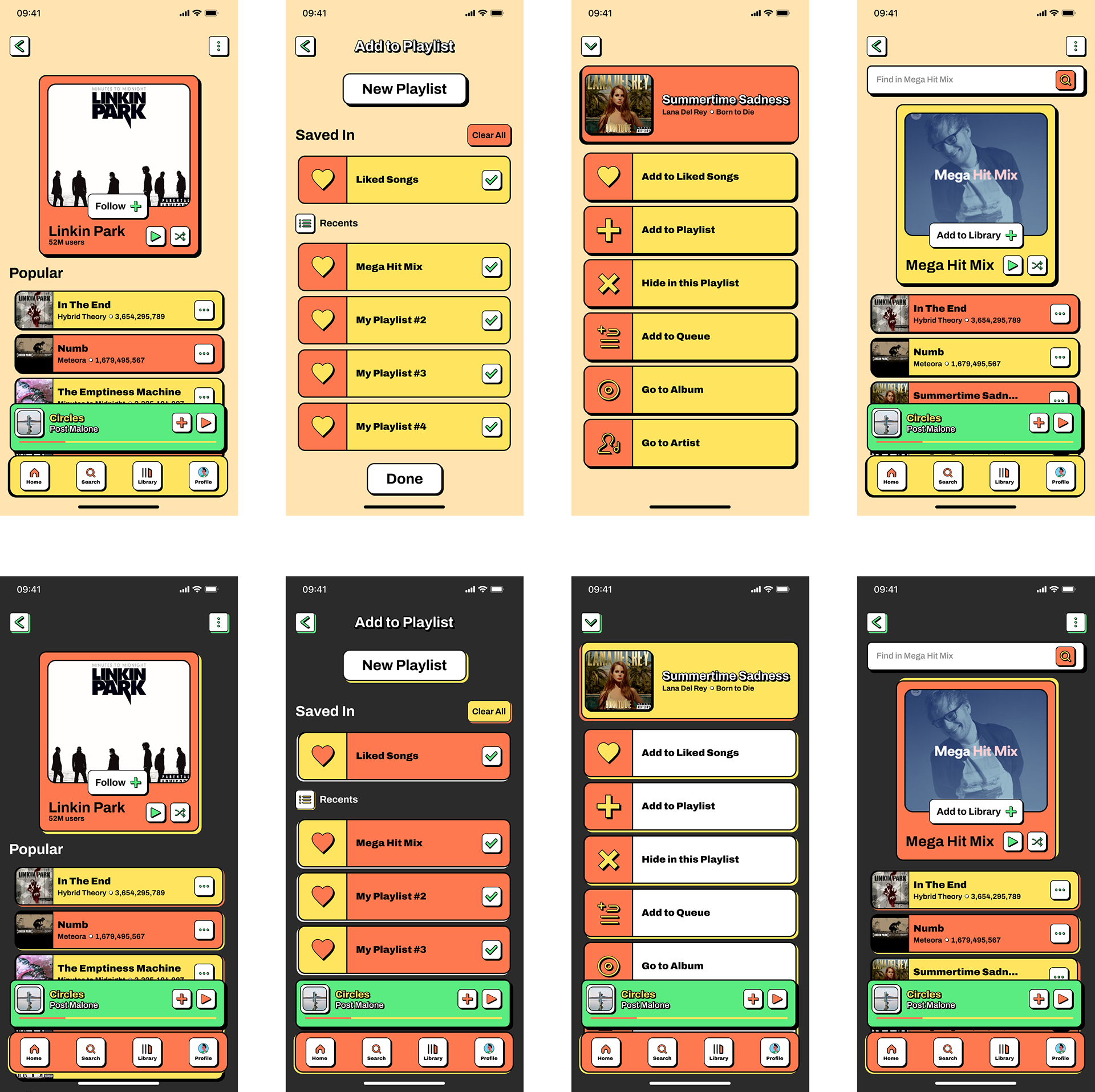
Reduce time-to-queue and time-to-save by removing overflow-menu dependencies.
Encourage playlist creation with a global, predictable, inline Add (+) action.
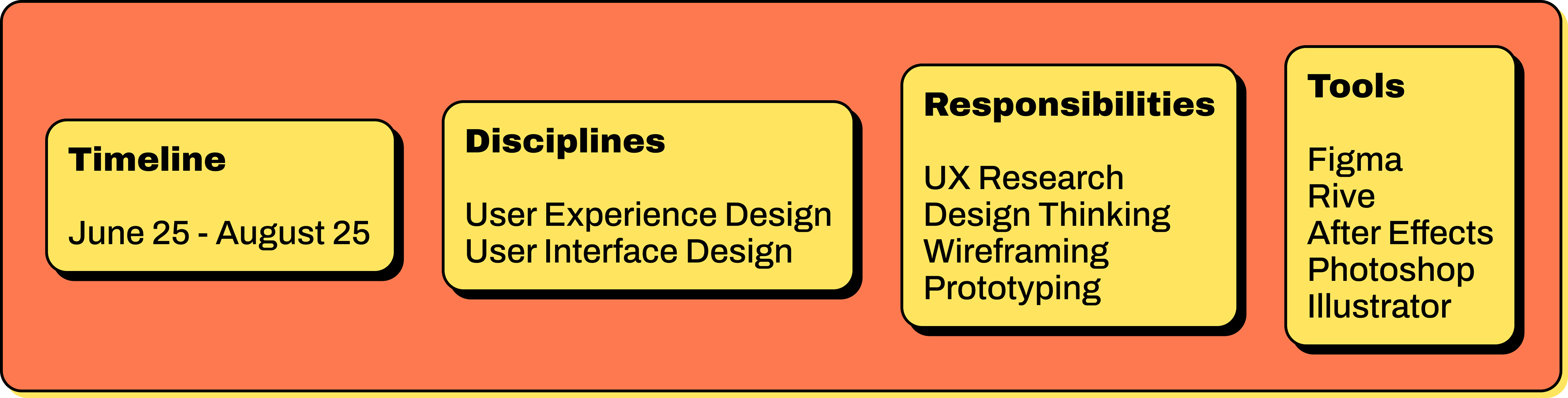
The Process
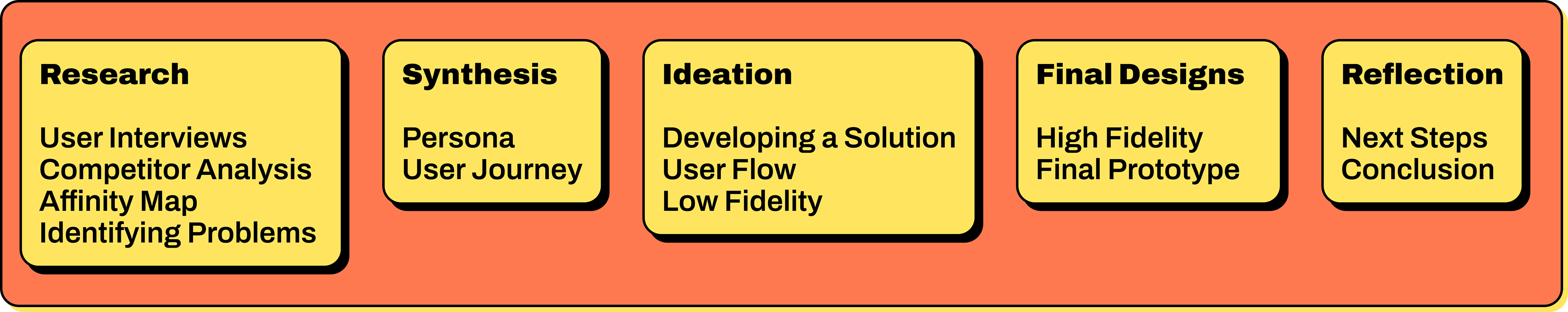
The Research
Barriers:
Hidden menus (“three dots problem”) slow down queuing and saving.
Duplicate icons and labels for similar actions create hesitation.
Discovery modules lack visual weight, reducing trust and visibility.
Cross-device continuity breaks when affordances differ between the app and the web.
Approach:
Conduct a heuristic audit of core flows: discover, search, save, queue, and playlist creation.
Run a competitive teardown focused on action visibility and semantics.
Build a pattern inventory of ambiguous states (e.g., likes vs saves, overflow vs visible actions).
Perform accessibility review for contrast, hit areas, motion, and keyboard focus.
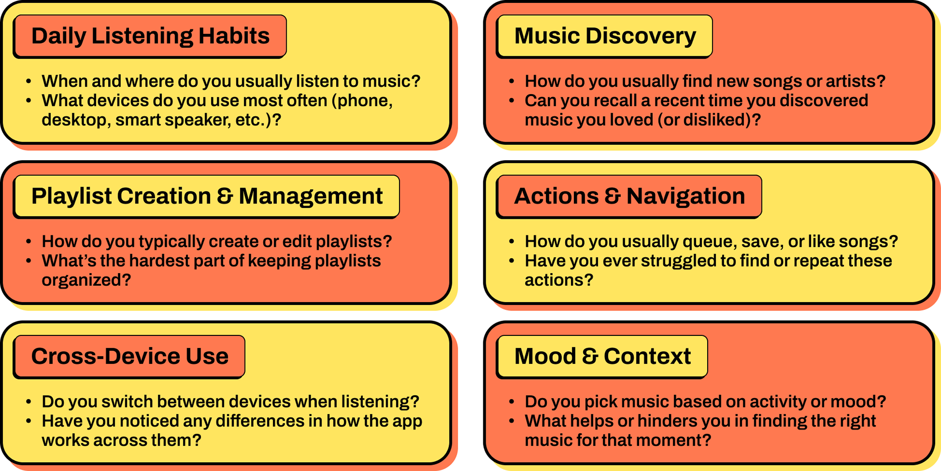
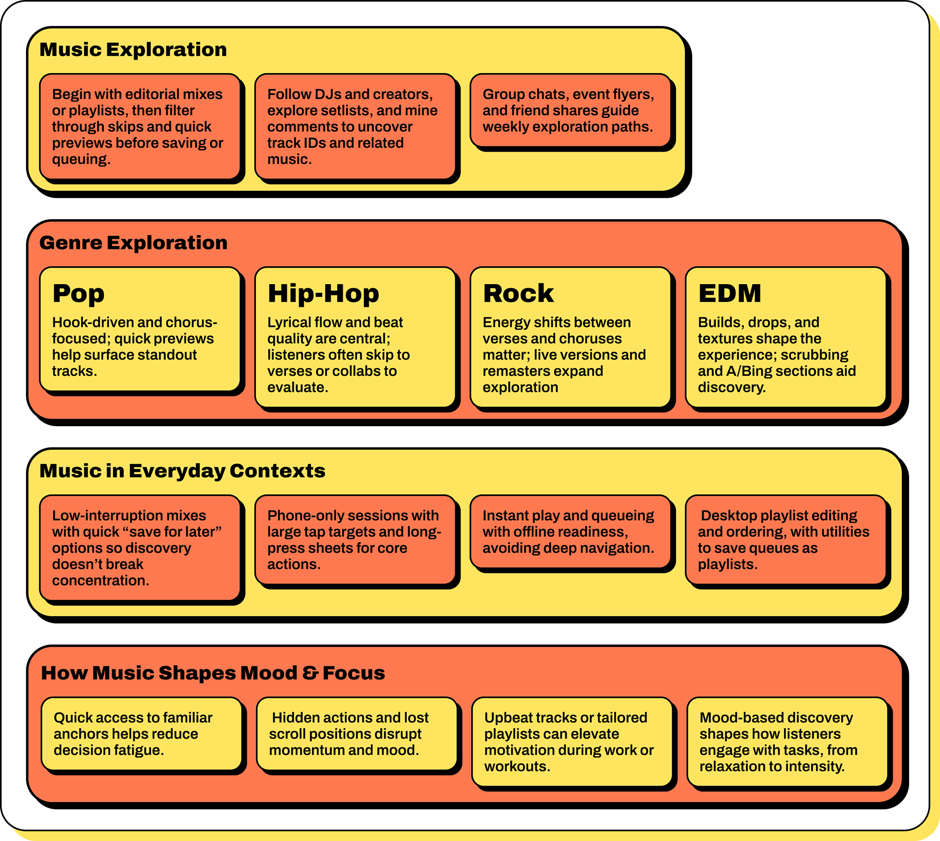
User Interviews
To understand how early‑stage curators and genre‑focused listeners discover, evaluate, and assemble tracks, so the redesign can remove friction in discovery, queueing, and playlist creation while preserving momentum and intent.
What was asked
Competitor Analysis
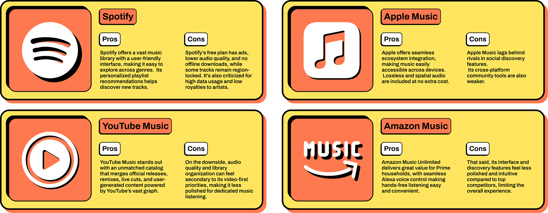
Here are the single strongest pros and cons for major Spotify competitors, focused on what most differentiates each today.
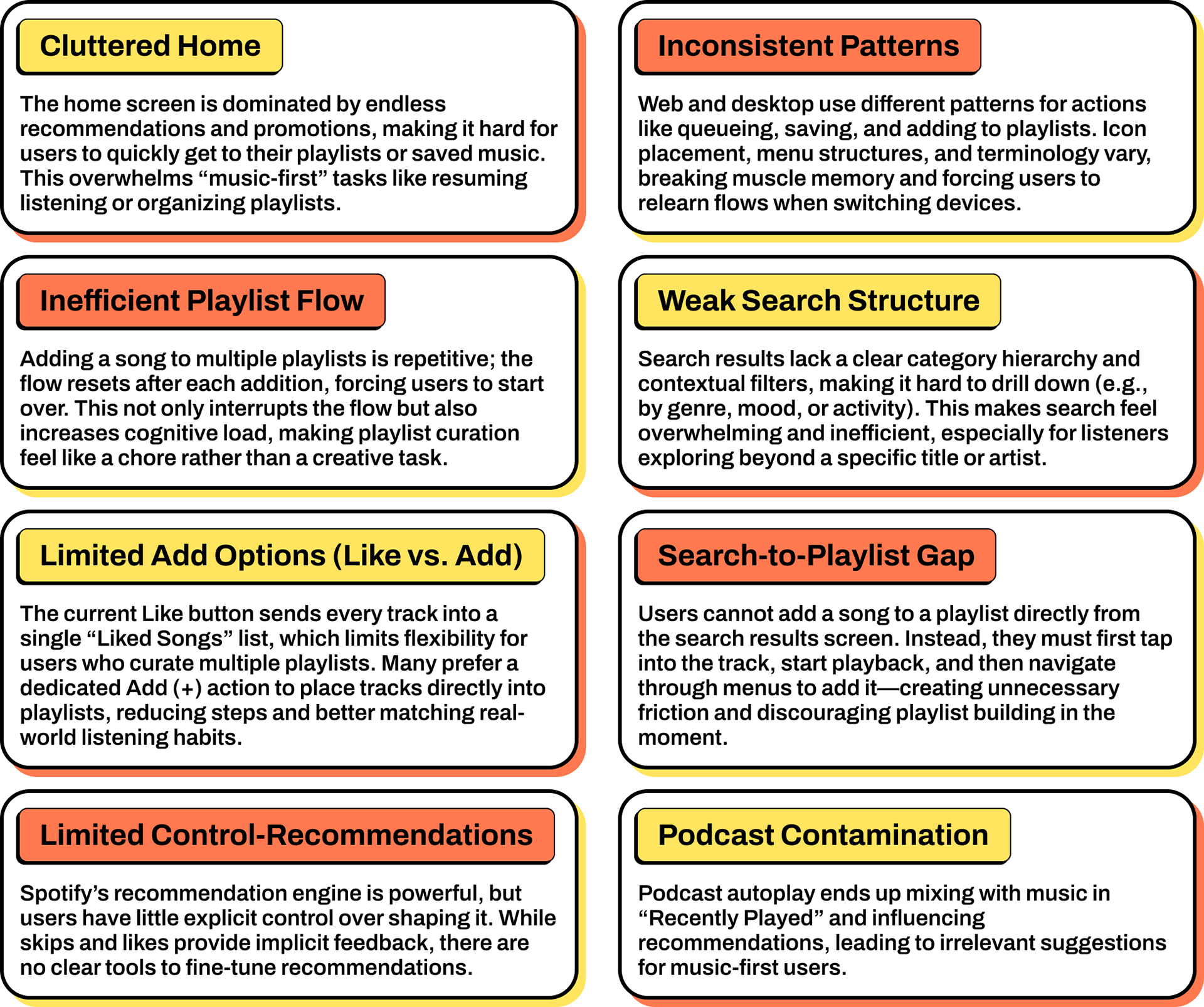
Affinity Map
Created an affinity map from user interviews and competitor analysis to surface recurring pain points. These insights informed the Spotify redesign, focusing on simplifying core actions, strengthening discovery, and improving cross-device continuity.
Identifying the problem
The Synthesis
The research revealed recurring friction in discovery, playlist curation, and cross-device continuity. Personas and journey mapping clarified user motivations, frustrations, and opportunities for redesign.
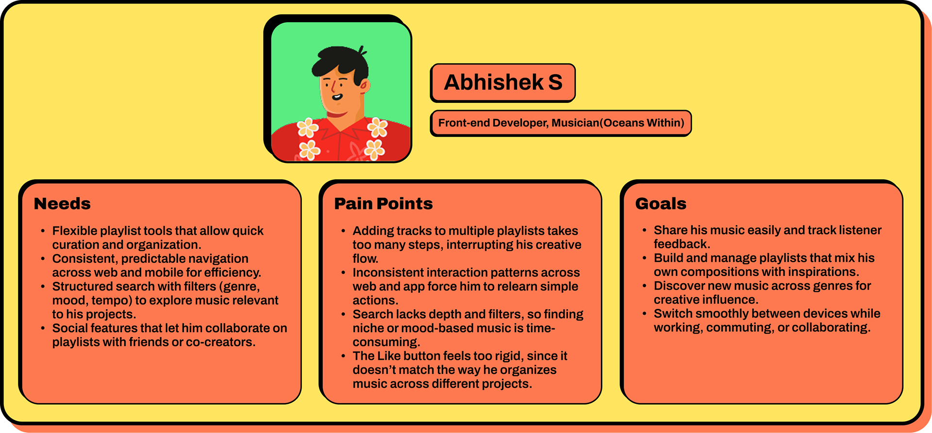
User Persona
I created a user journey to map how to navigate Spotify, focusing on the emotional highs and lows across discovery, playlisting, and cross-device use. This visualization revealed friction points and opportunities, providing clear direction for a redesign that streamlines engagement, empowers curation, and strengthens continuity across platforms.
User Journey
The current journey from discovery to playlisting is fragmented: users scroll through cluttered feeds, struggle with limited add options, and face inconsistent flows across devices. A reimagined journey prioritizes clarity and consistency, turning playlisting into a fluid, creative act supported by predictable actions and cross-platform alignment.
Key Observations
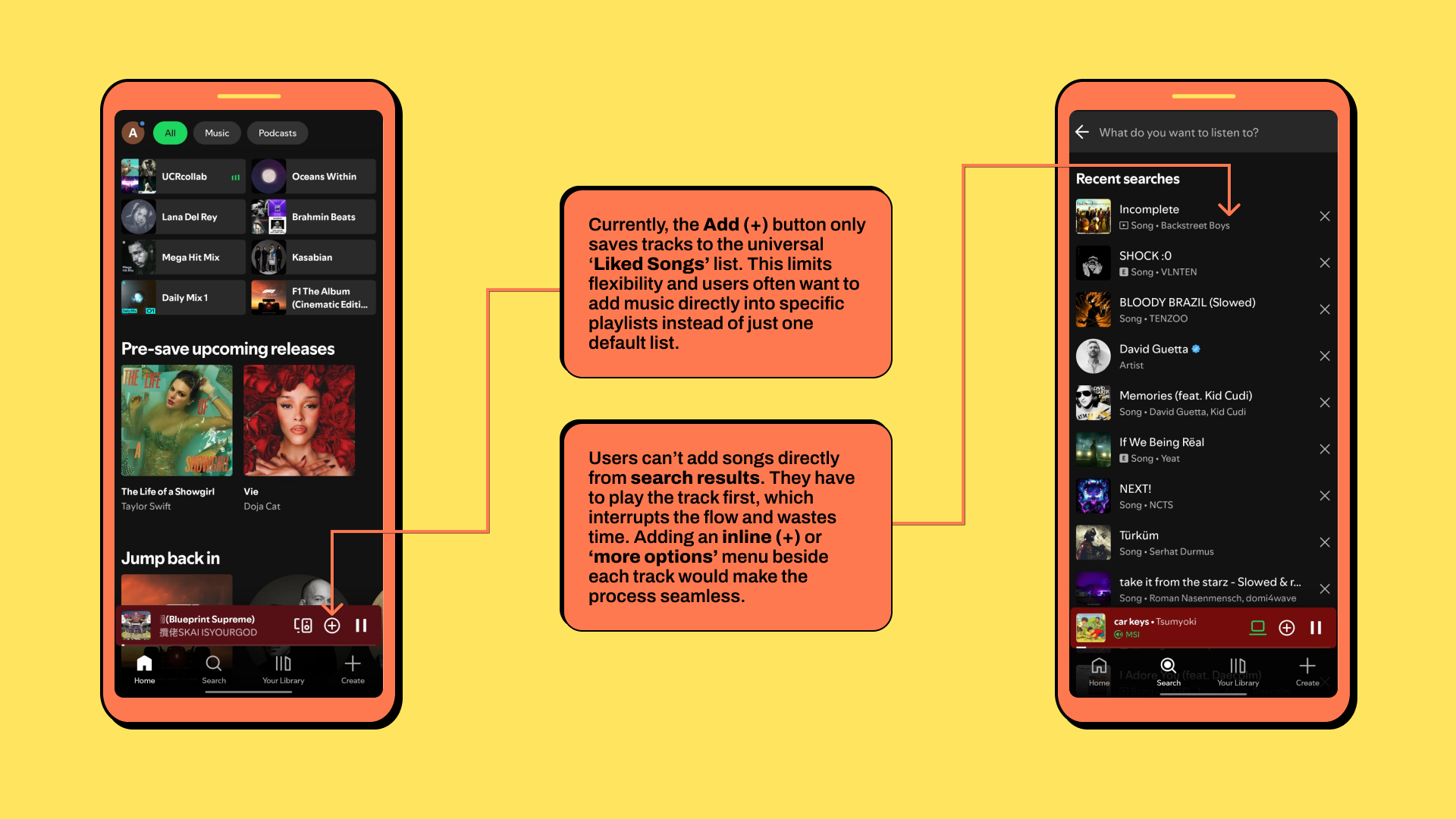
Discovery: Users encounter cluttered recommendations and weak filters, making it hard to find relevant music.
Selection: Adding a song requires multiple steps, with no option to add to multiple playlists at once.
Curation: The Like button forces a single “Liked Songs” list, which doesn’t reflect varied moods or projects.
Continuation: Inconsistent flows across mobile, web, and desktop break muscle memory and session continuity.
The Ideation
Developing the solution
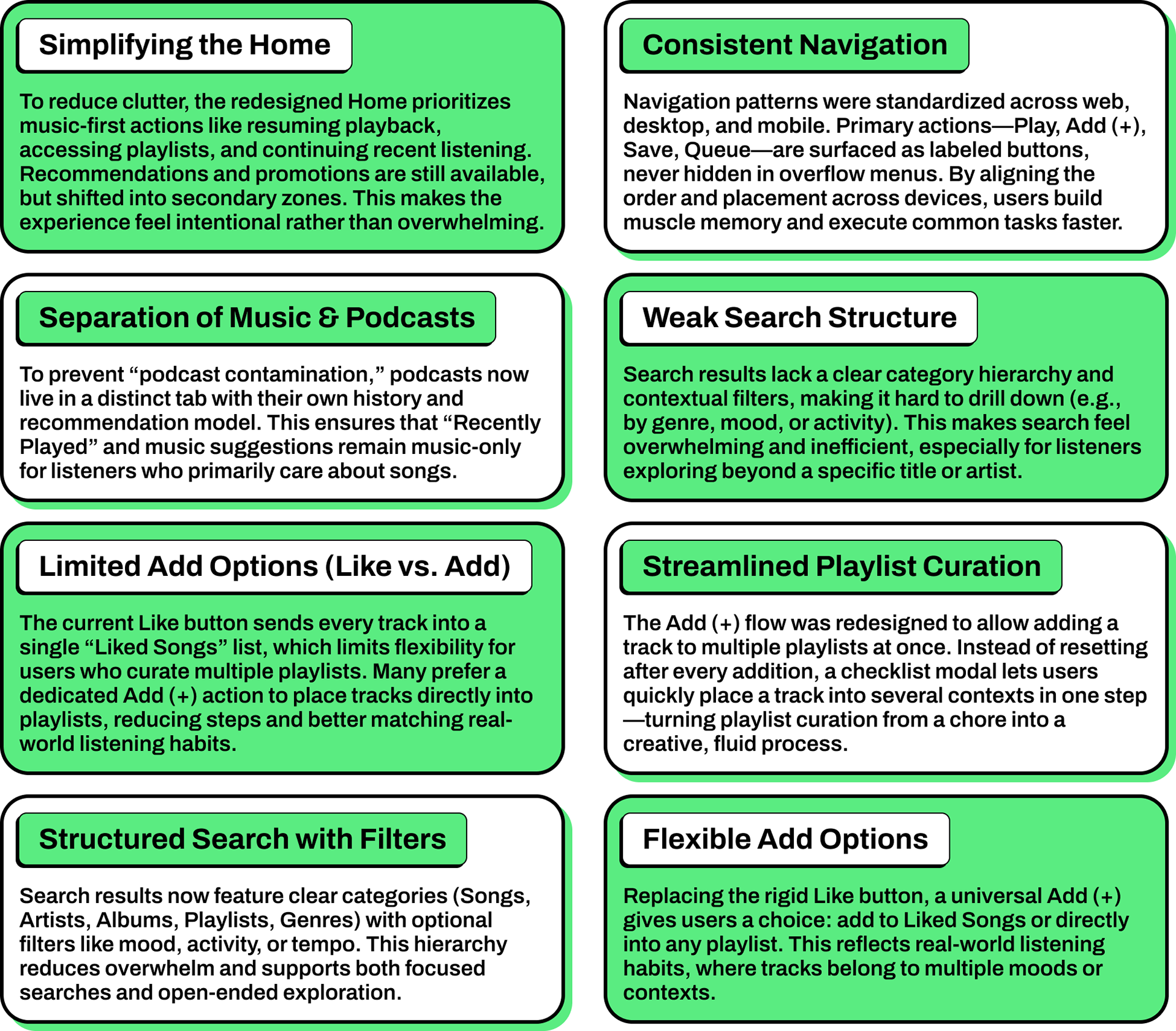
The problems uncovered in research shaped a set of clear design priorities: reducing friction, restoring user control, and creating consistency across platforms. Instead of introducing new complexity, the goal was to streamline core listening tasks and make Spotify feel more predictable and empowering.
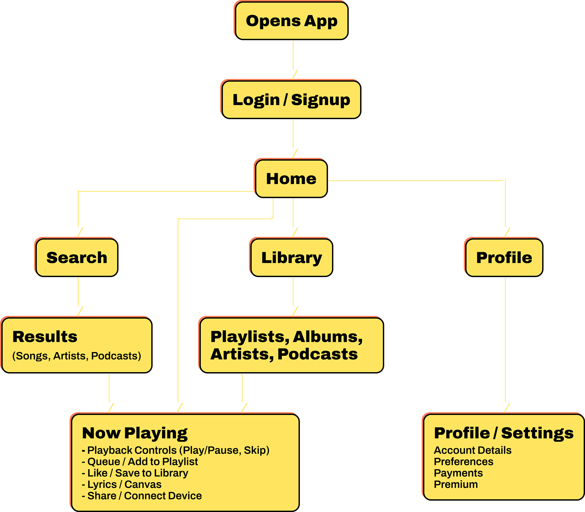
Task Flow
Building on our redesign goals and synthesized research, I crafted a user flow to map how listeners and creators move through discovery, playlisting, and cross-device playback. The flow highlights key paths and scenarios within the redesigned screens, surfacing where clarity, consistency, and efficiency can best support user needs.
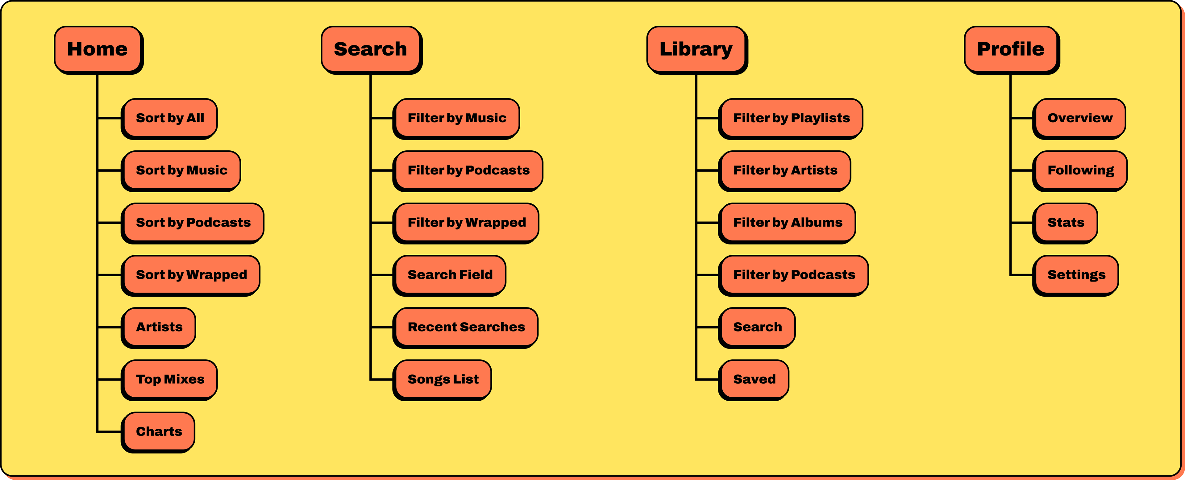
Information architecture
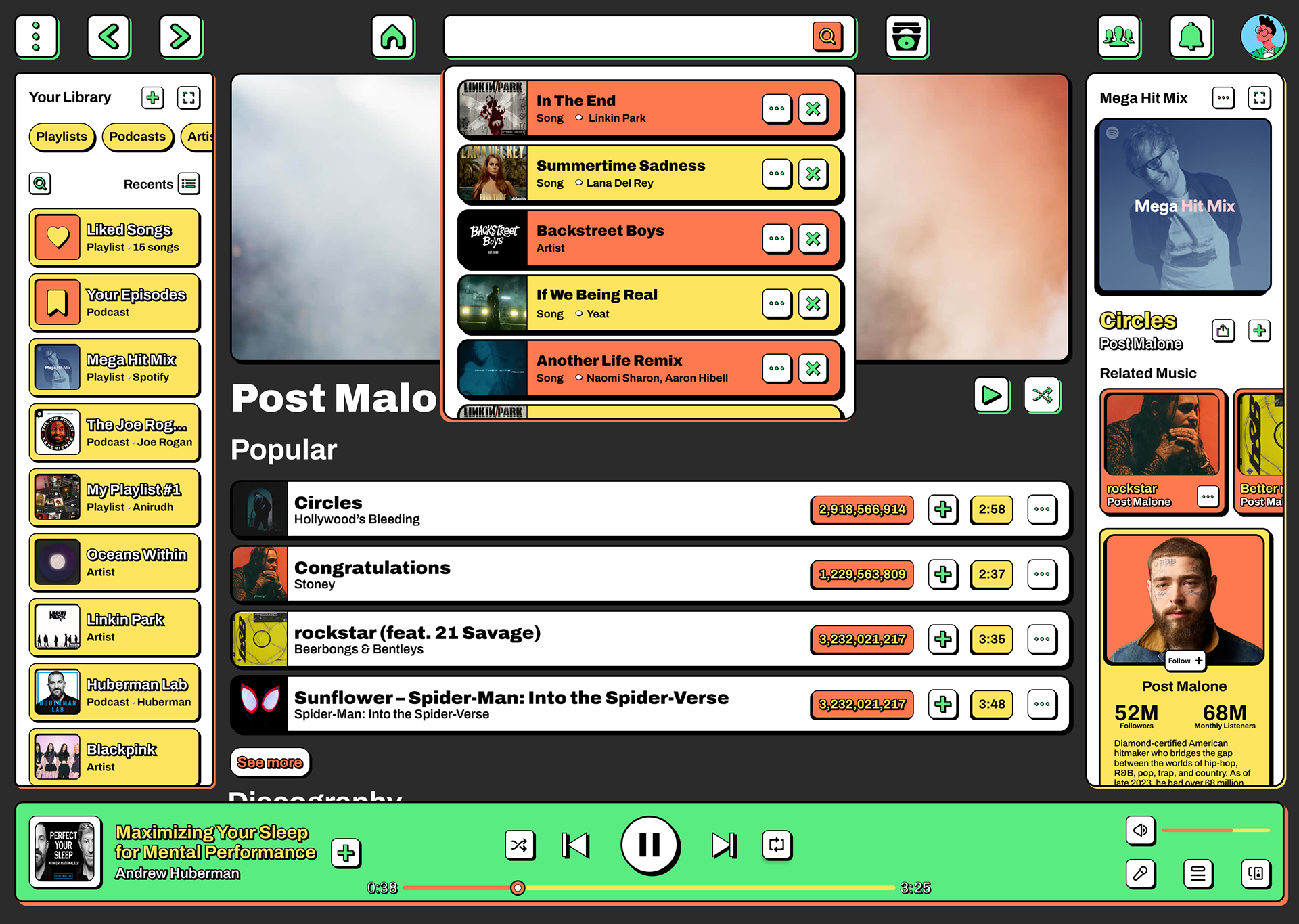
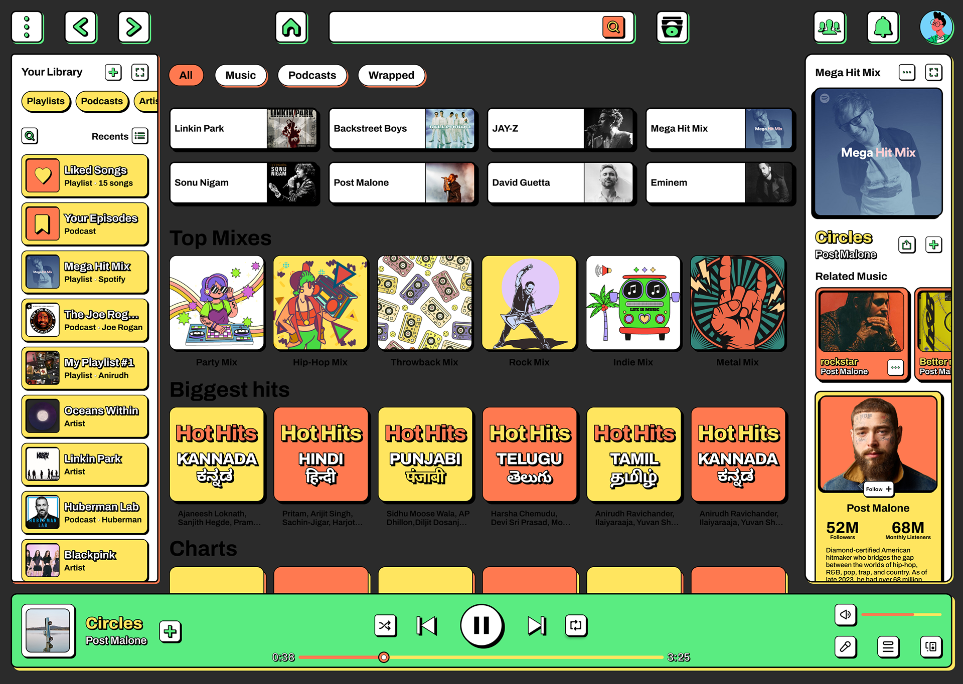
The information architecture streamlines navigation by prioritizing music-first actions such as play, add, queue, and save. Clear hierarchies and consistent patterns across mobile and web reduce cognitive load and build reliable muscle memory.
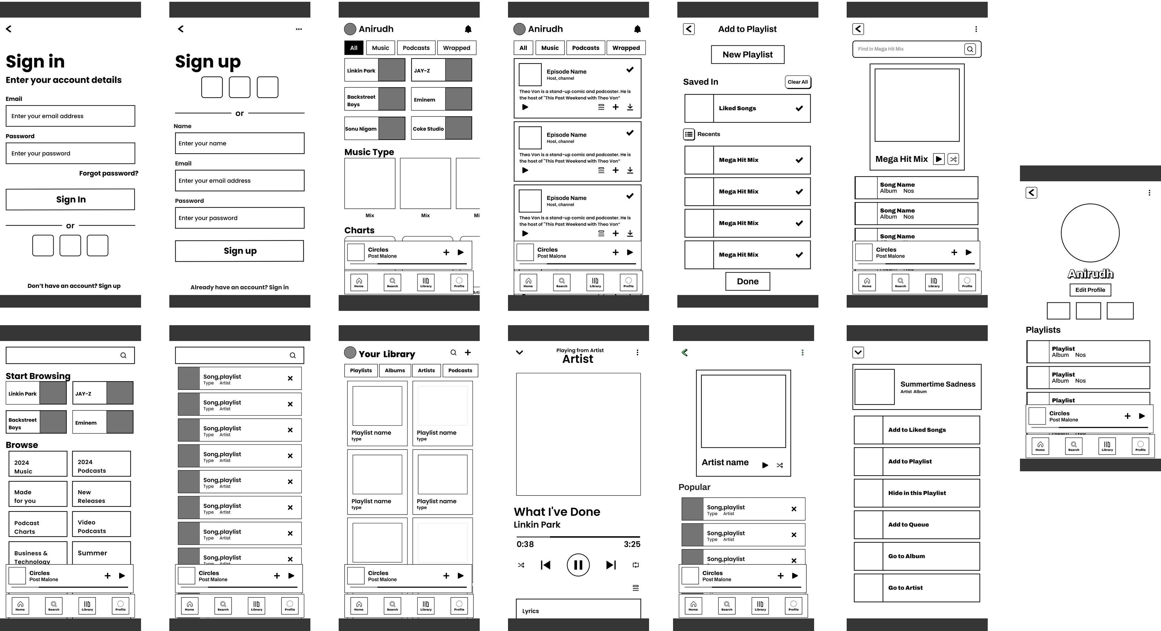
Low Fidelity Design
Low-fidelity wireframes were developed to explore layout structures, navigation patterns, and action hierarchies without visual distractions. These sketches allowed rapid iteration on discovery flows, playlist interactions, and cross-device continuity before committing to detailed visuals.
Design Principles
Function over ornament
Every bold element communicates an action, state, or structural boundary. Decorative details are minimized to keep the interface purposeful.
Every bold element communicates an action, state, or structural boundary. Decorative details are minimized to keep the interface purposeful.
Strong hierarchy
Large typography, thick outlines, flat components, and high contrast ensure immediate scannability and quicker target acquisition.
Large typography, thick outlines, flat components, and high contrast ensure immediate scannability and quicker target acquisition.
Consistent primitives
Cards, buttons, and lists use the same outlined style, clear hit-areas, and predictable hover/press states across modes and platforms for a unified experience.
Cards, buttons, and lists use the same outlined style, clear hit-areas, and predictable hover/press states across modes and platforms for a unified experience.
Why Neubrutalism
Neubrutalism’s high‑contrast palettes, heavyweight type, thick borders, and raw, flat components cut through visual noise, which is ideal for dense catalogs and time‑sensitive micro‑decisions like “play next,” “save,” or “share”. The style also tends to produce lighter, faster pages by eschewing heavy effects and frameworks benefiting performance, battery, and accessibility at scale.
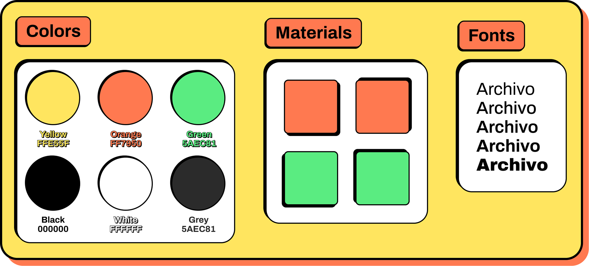
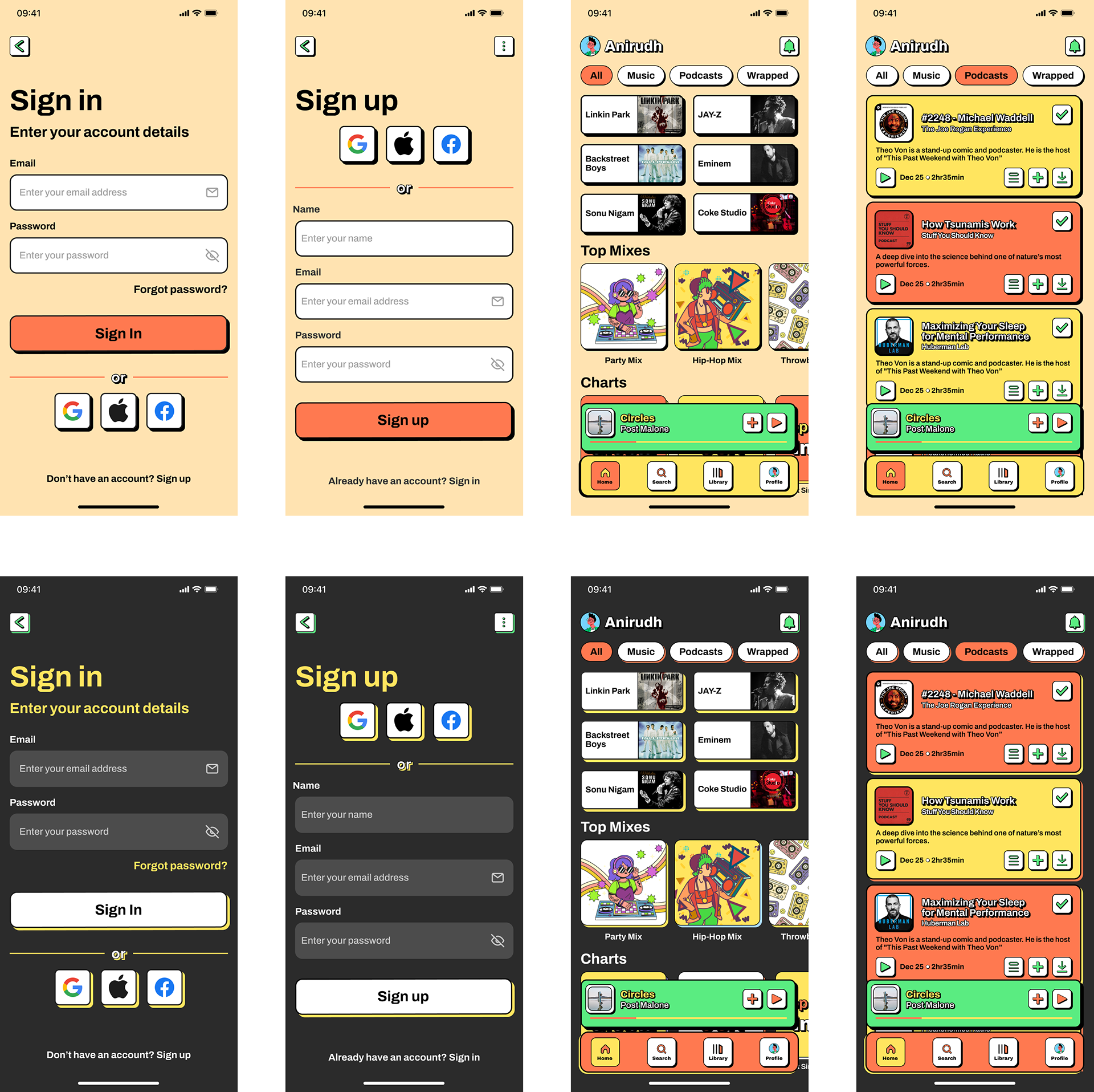
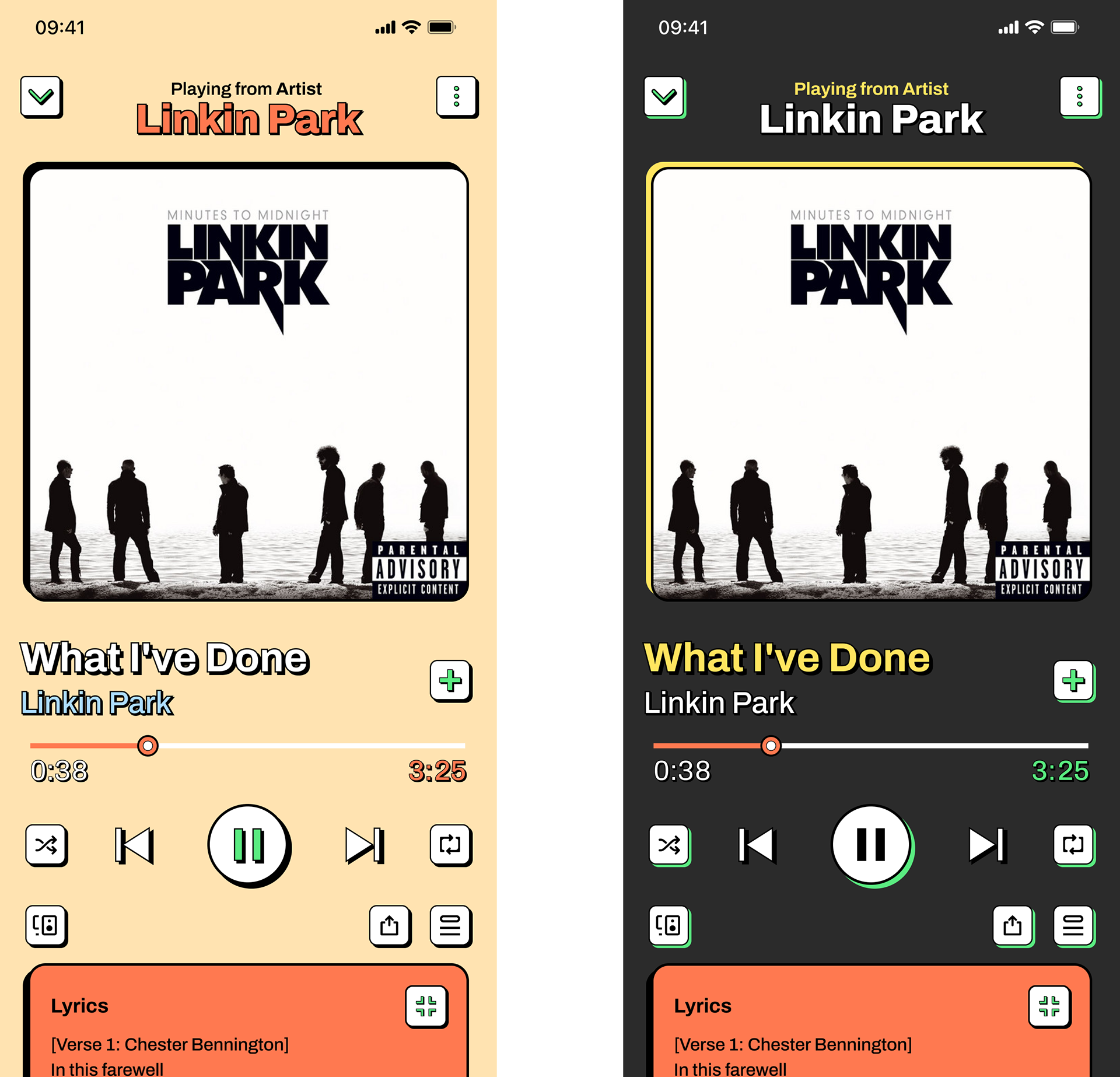
Light & Dark Modes
Light mode uses bright, clashing accents with pure black outlines; dark mode flips to deep neutrals with high‑contrast ink on high‑chroma accents, maintaining WCAG guidelines.
Shadows are replaced by offset black rectangles and isometric‑style accents for depth signaling without blur, consistent with neubrutalist idioms.
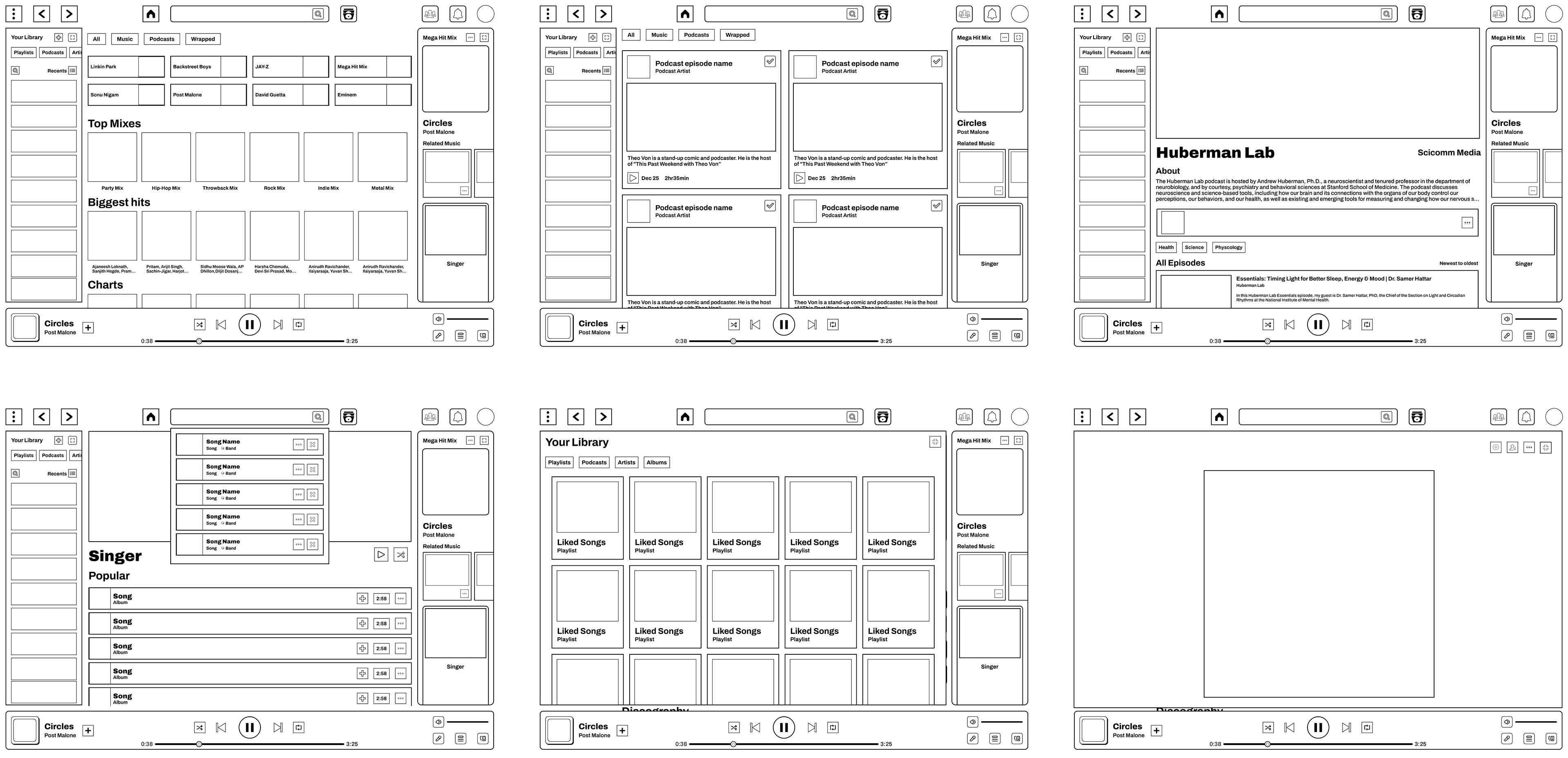
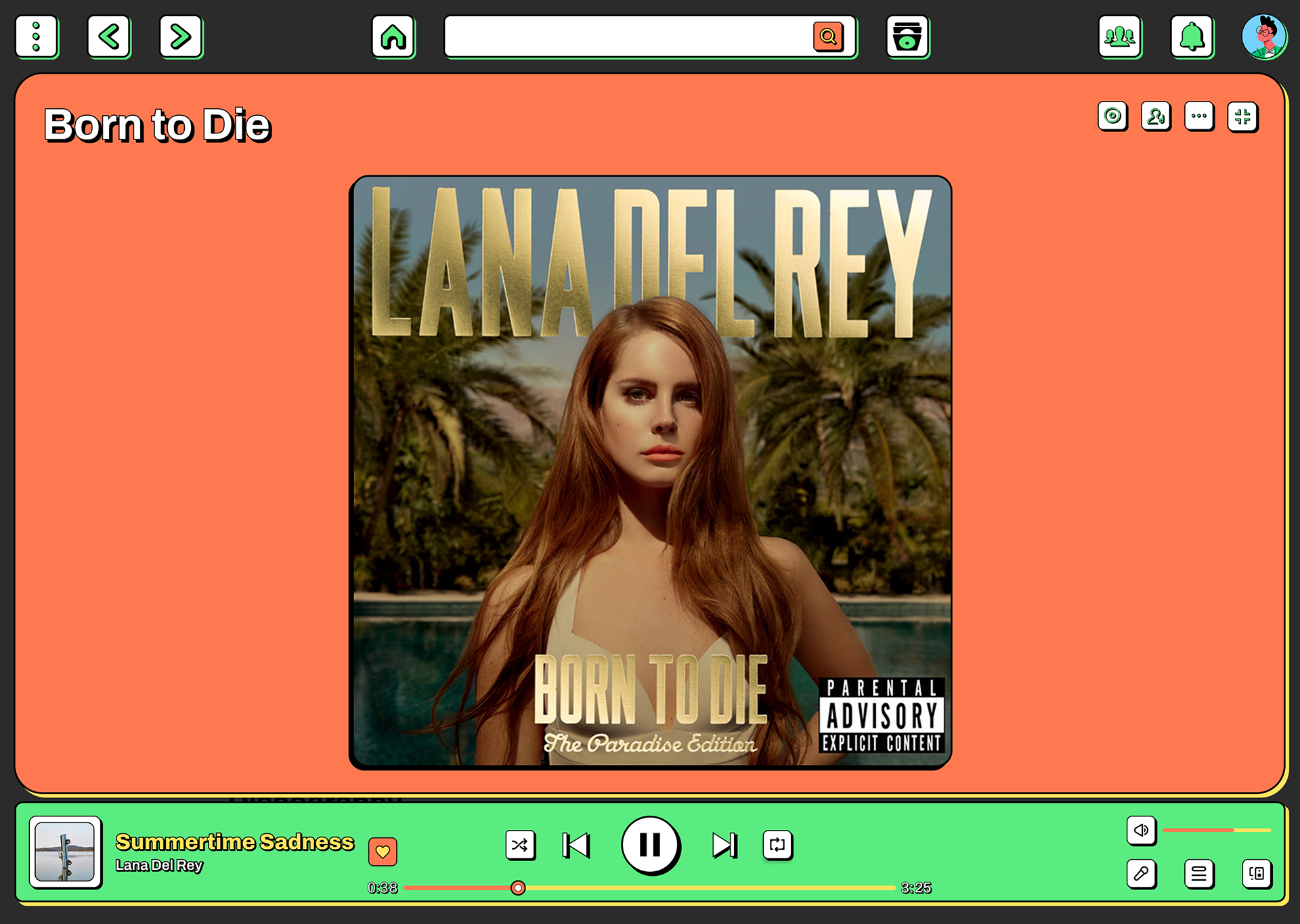
High-Fidelity Design
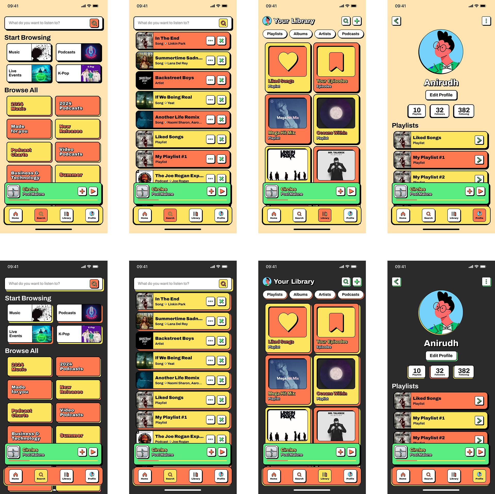
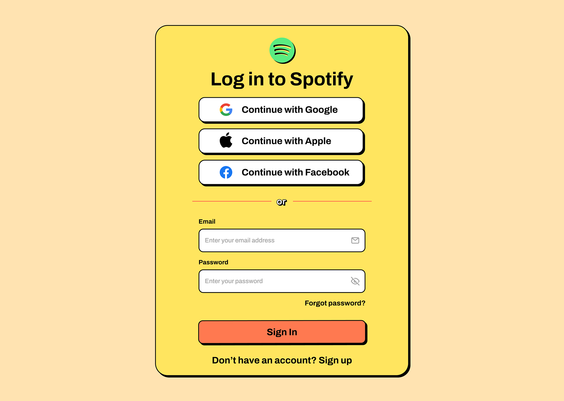
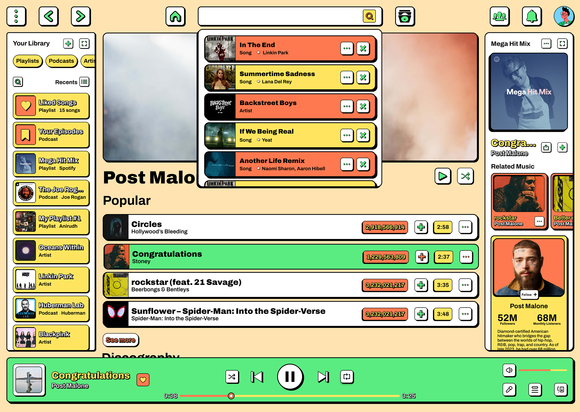
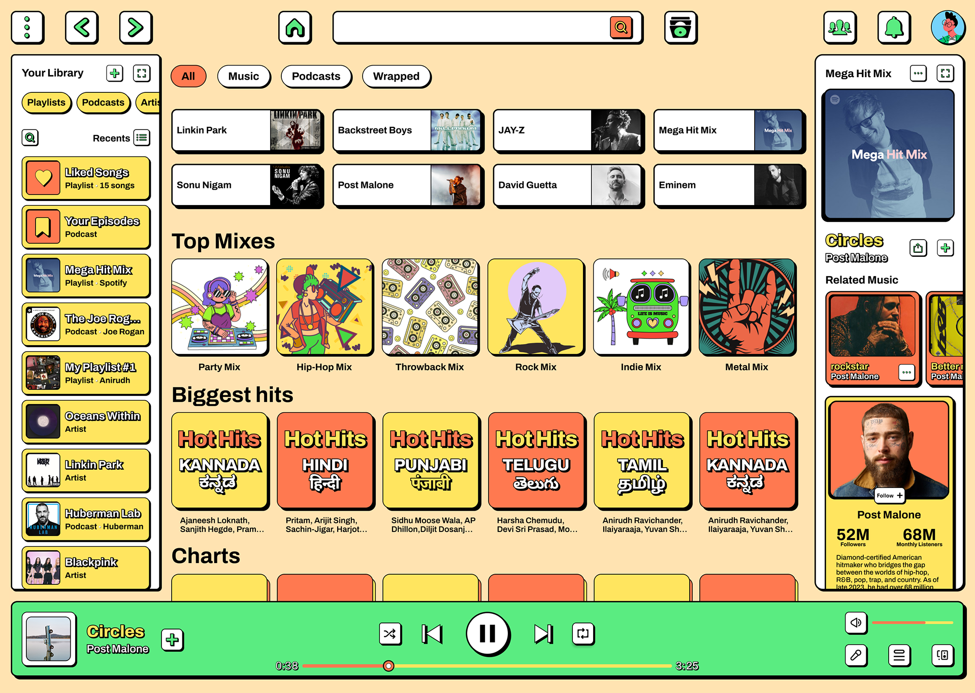
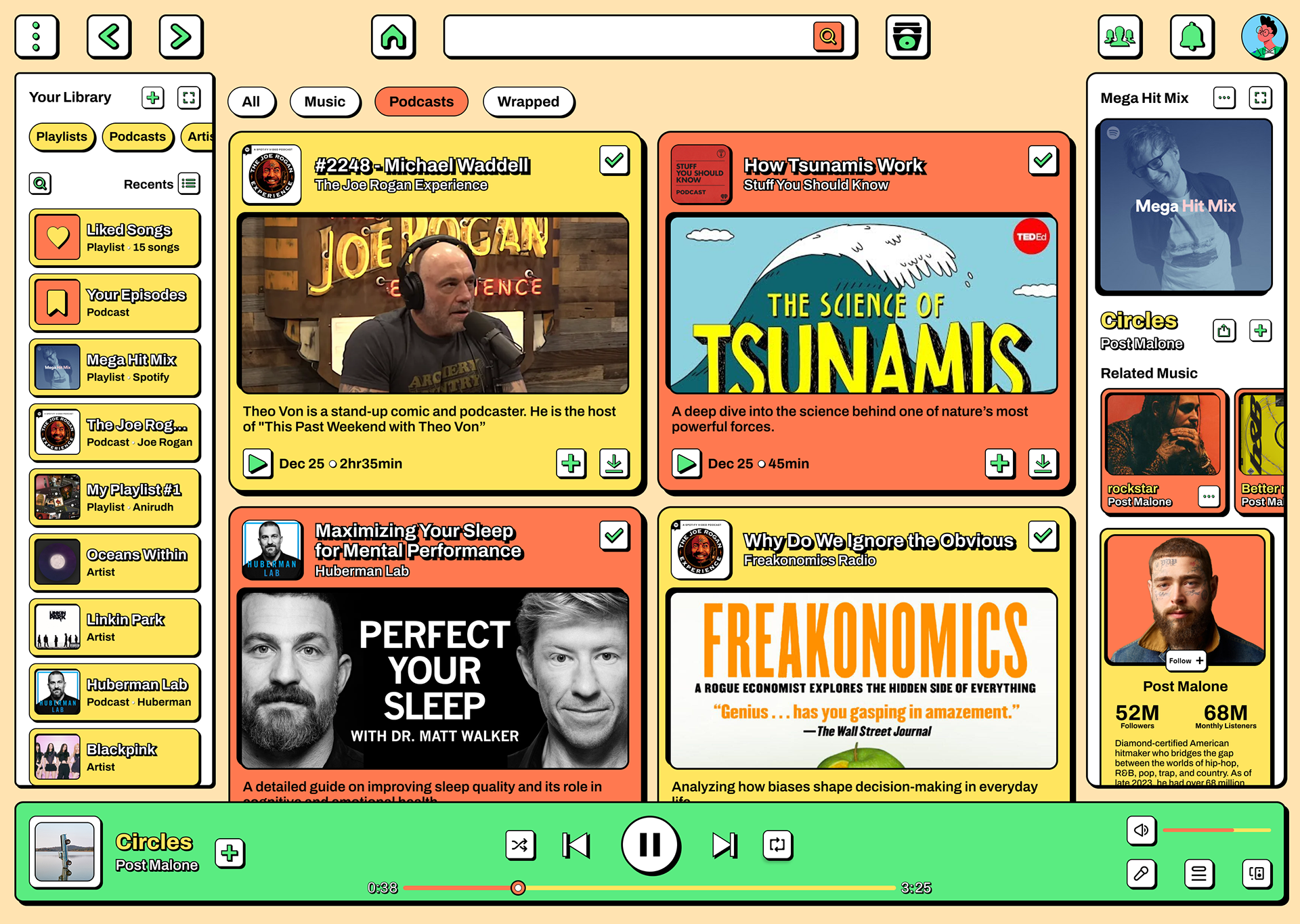
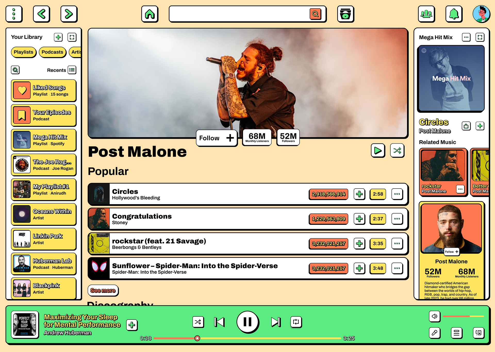
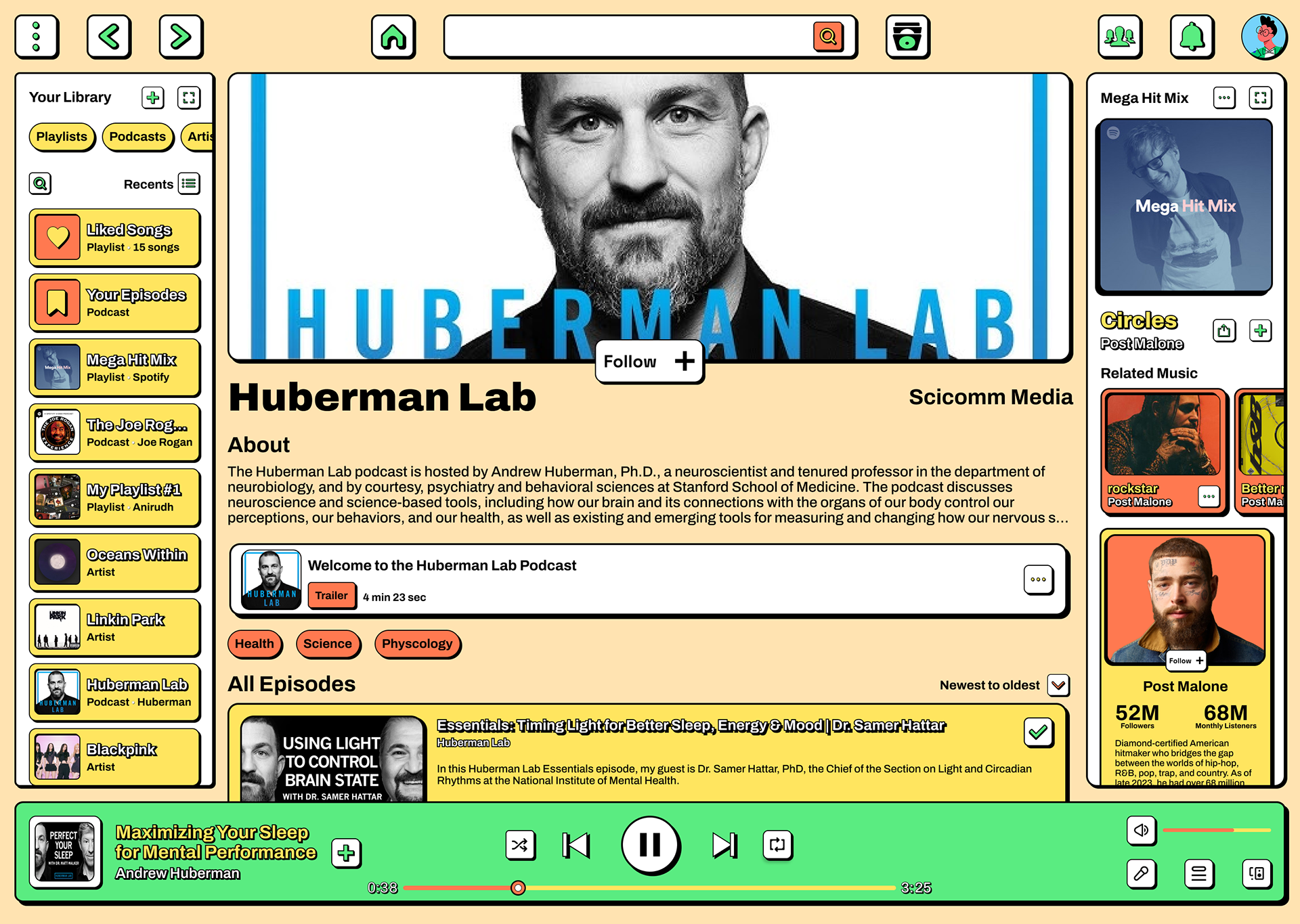
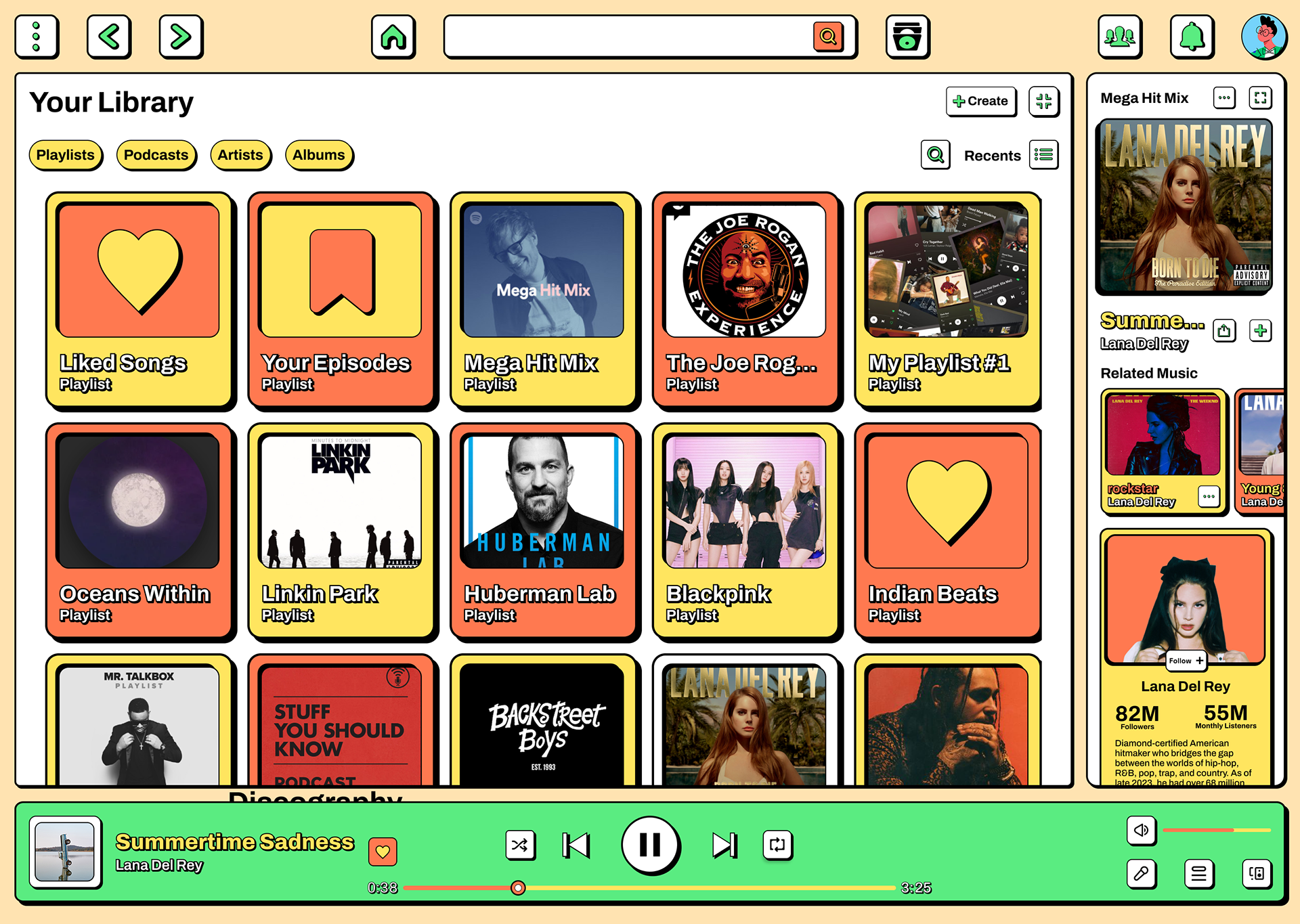
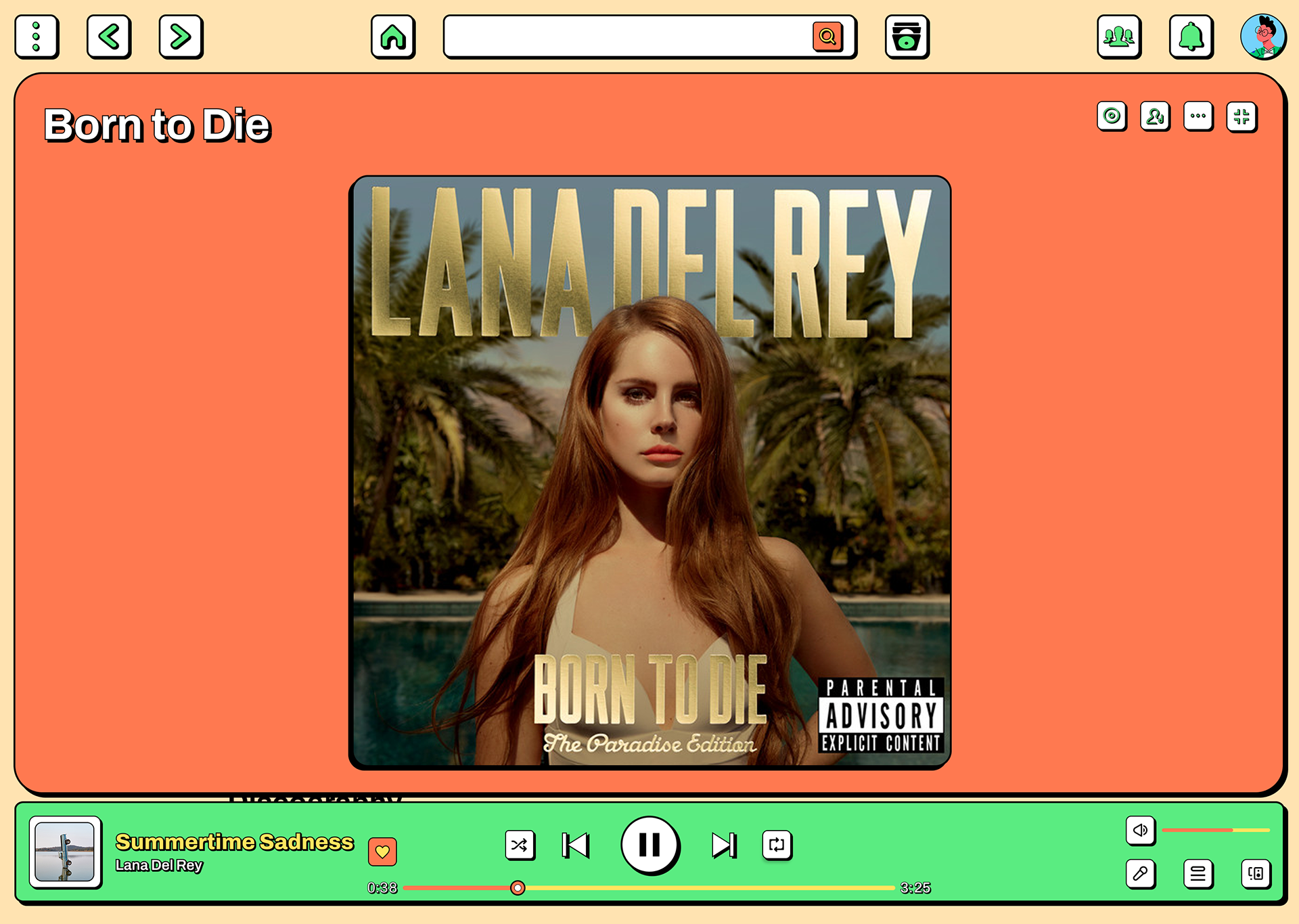
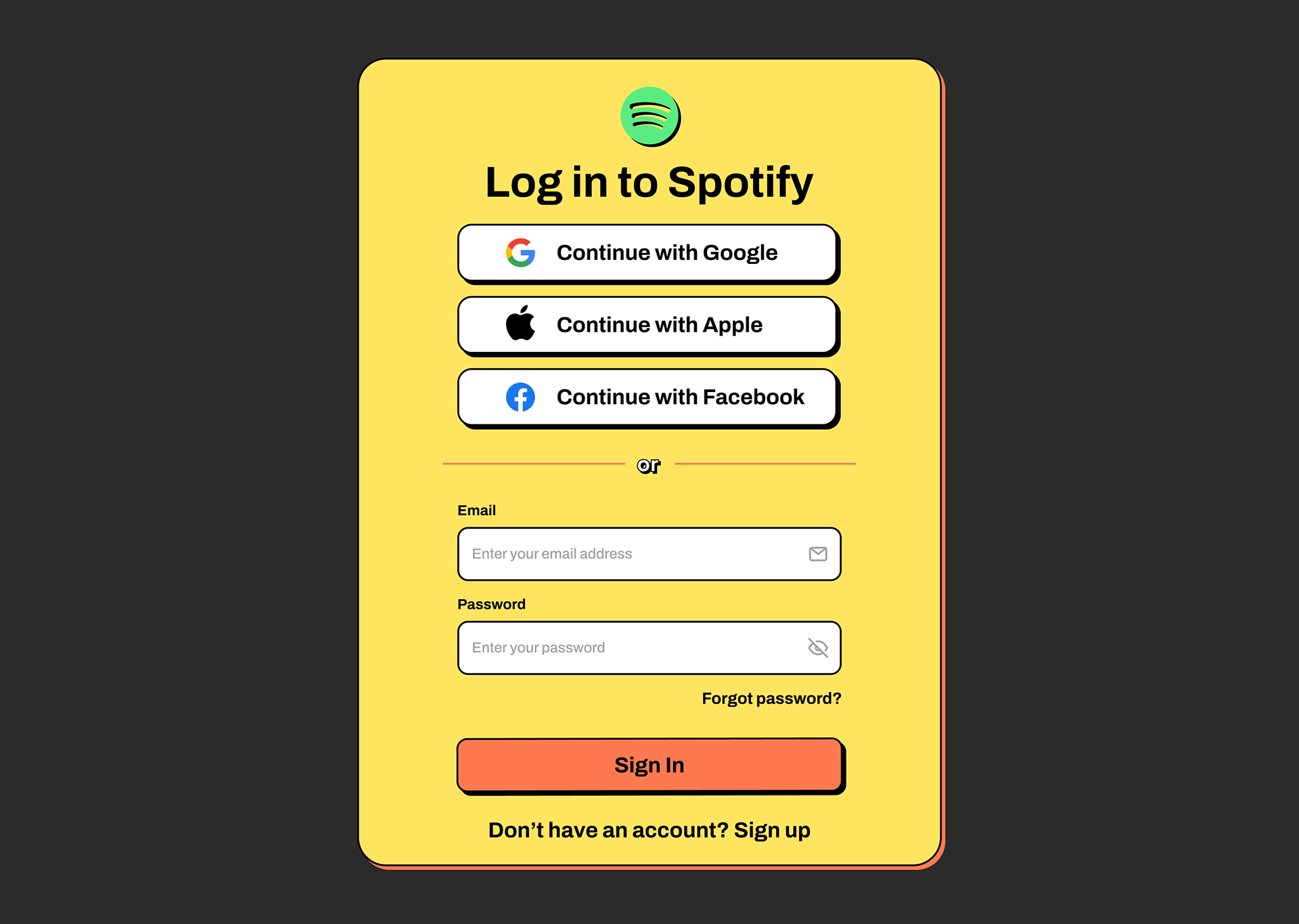
After validating the core ideas through low-fidelity prototypes, the concepts were refined into high-fidelity designs. These mockups capture the final visual direction, bringing together typography, color, layout, and interaction details. The goal was to simulate the real product as closely as possible, with realistic scenarios and ensuring design consistency across mobile and web platforms.
Solution Comparison
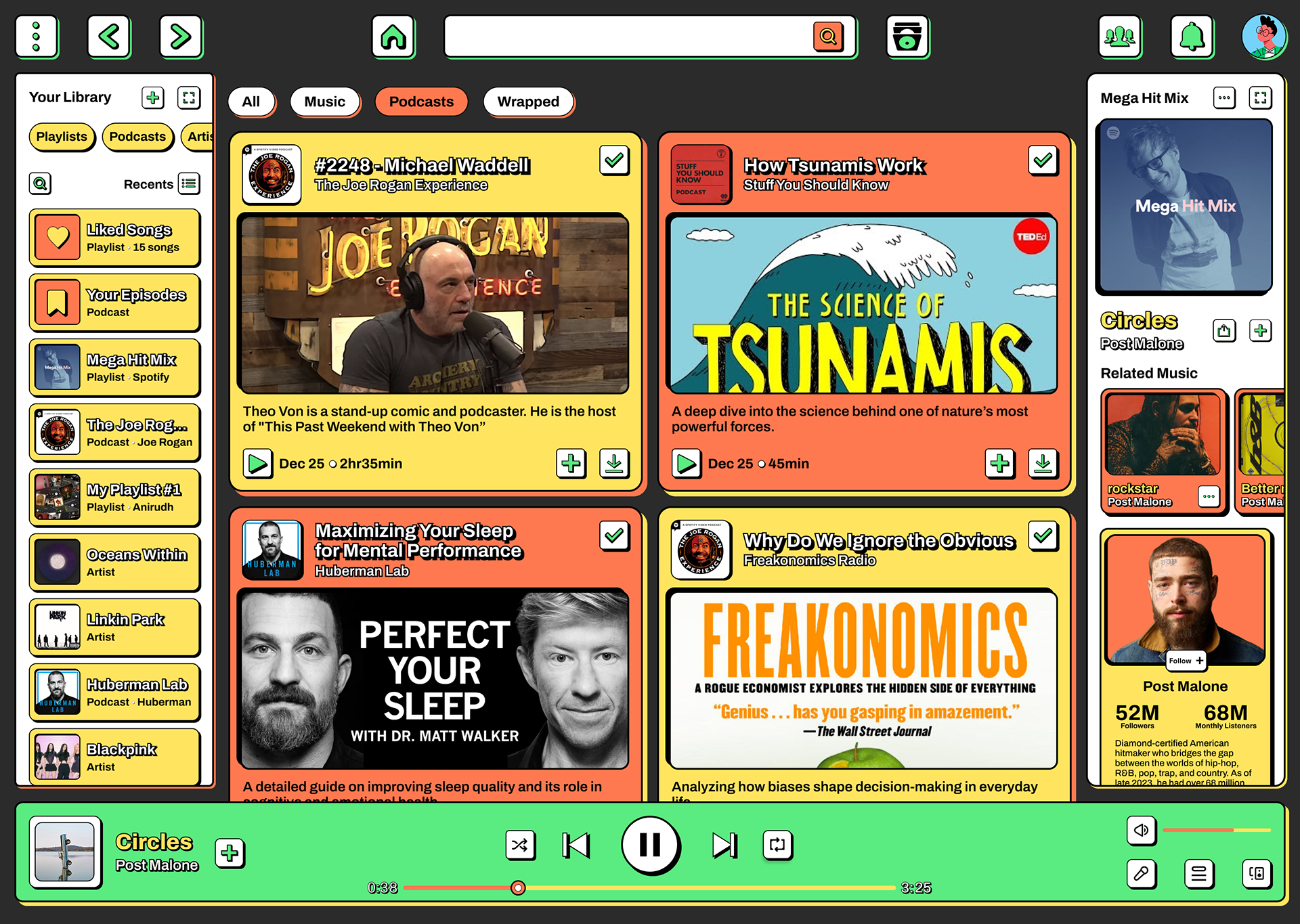
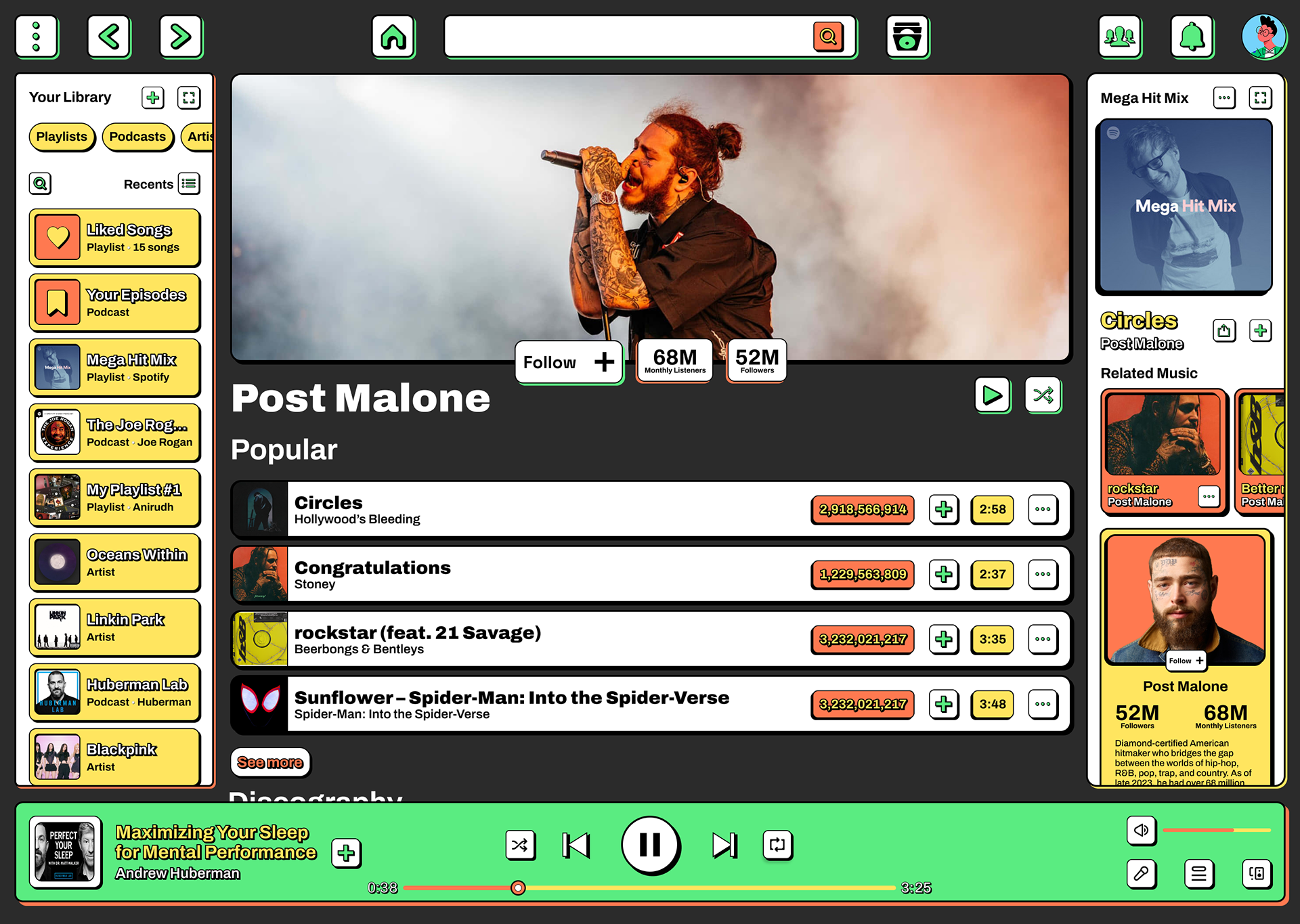
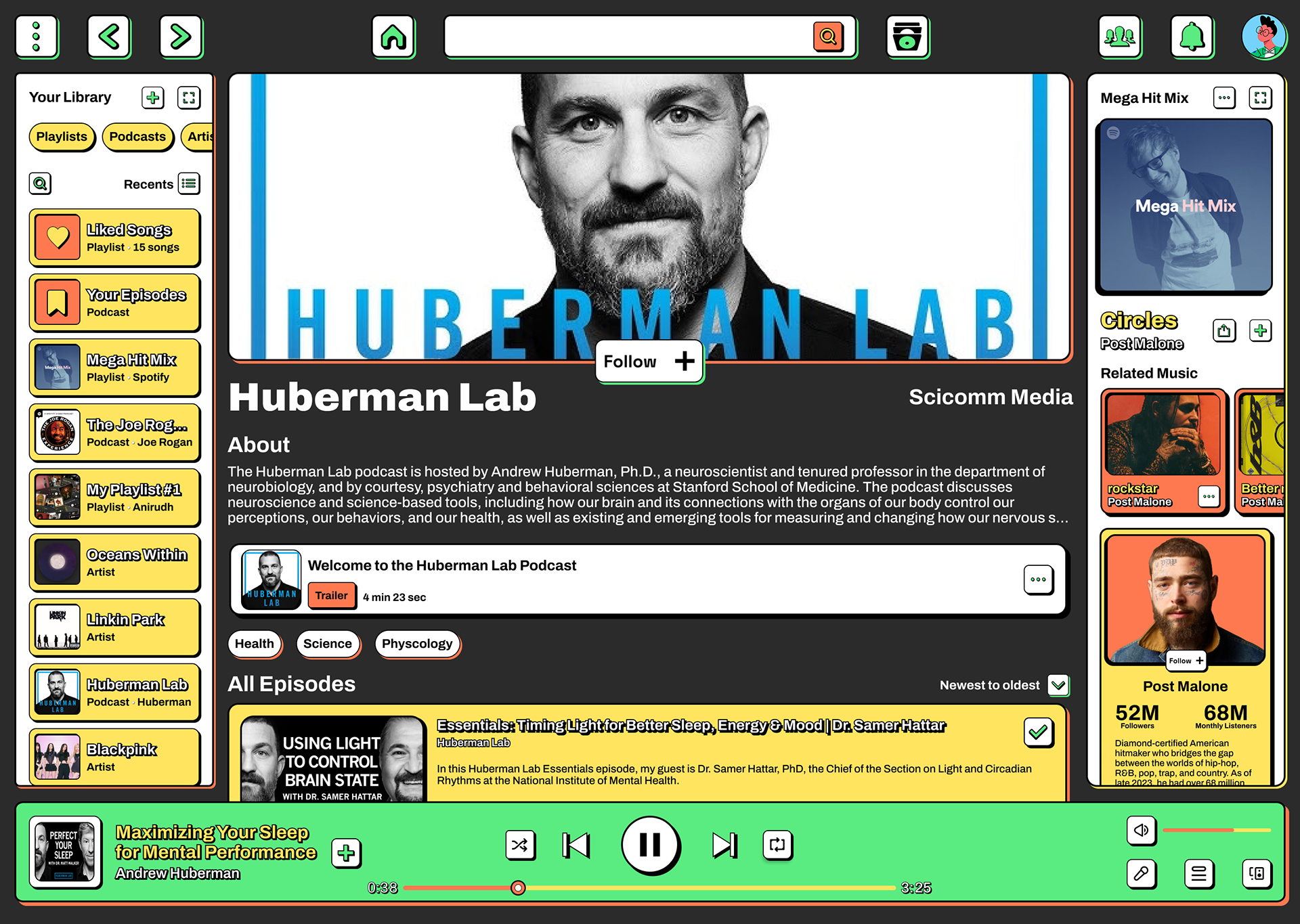
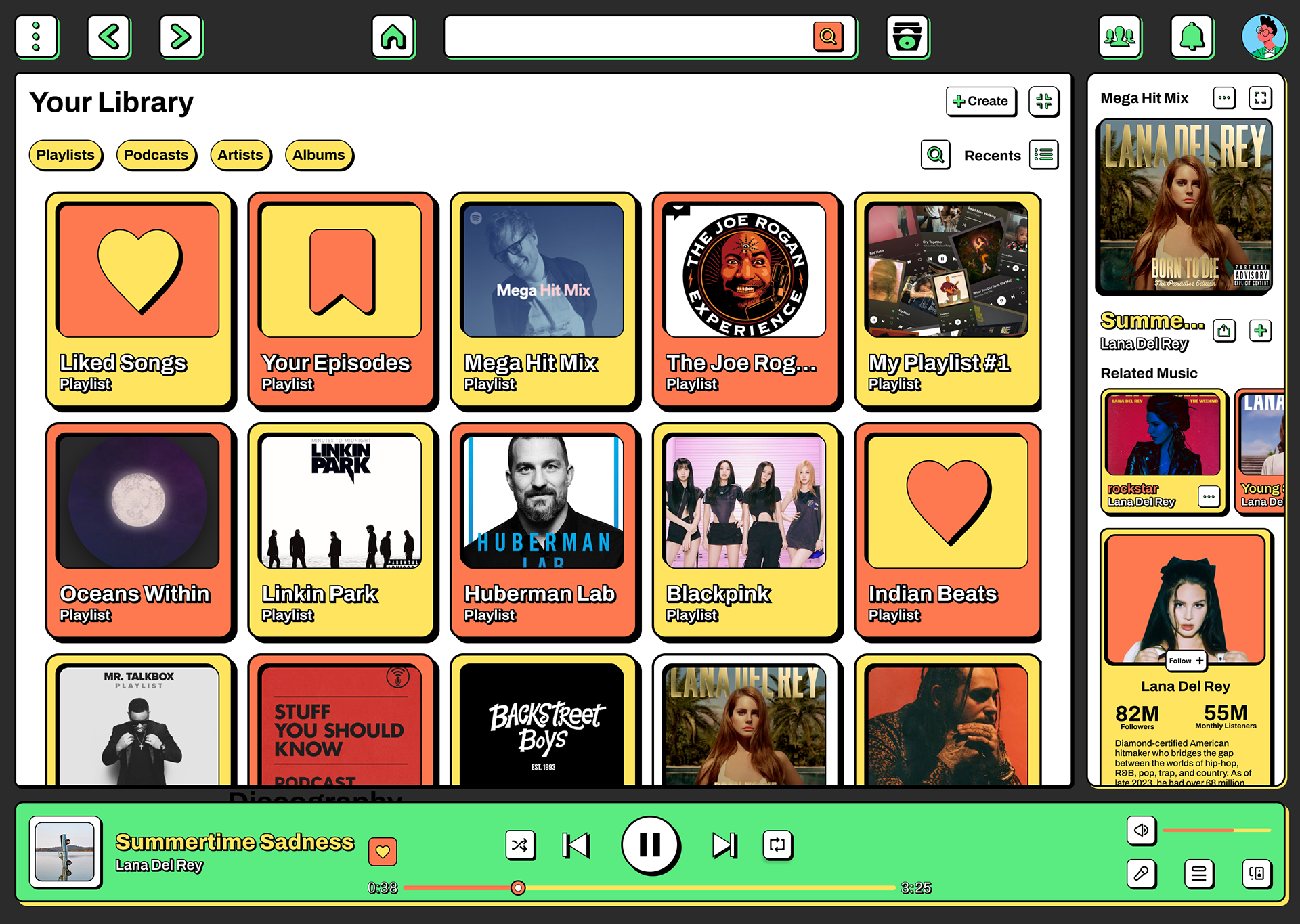
Mobile & Web Screens
The Reflection
Looking back on this project, I identified several key learnings, challenges, and opportunities for future growth. These reflections not only shaped the outcome but also provided direction for what comes next.
Key Learnings & Insights
Cross-device prototyping revealed interaction inconsistencies not visible in single-platform designs.
Bold visual hierarchy significantly improved user confidence in discovery scenarios.
Consistent interaction patterns reduced cognitive load more than anticipated.
Neubrutalist aesthetics enhanced trust perception, contrary to initial stakeholder concerns.
Next Steps
Voice control integration for hands-free playlist management.
Collaborative playlist features with real-time editing capabilities.
AI-powered curation assistant integrated into the neubrutalist interface.
Social discovery features while maintaining visual design principles.
Accessibility innovations, such as haptic feedback for music discovery.
Conclusion
This project demonstrates how bold design choices can improve usability when grounded in user research and accessibility principles. The success metrics suggest that users appreciate clarity and consistency over visual novelty, providing a framework for future music platform innovations.